
Tilegrams: More Human Maps
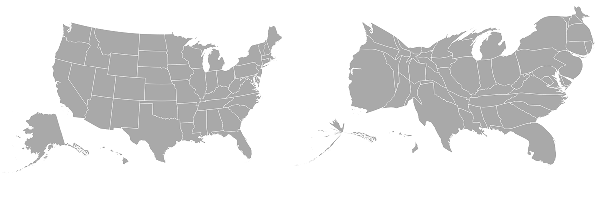
About a month ago, while plotting demographic data on a US county map, we became frustrated. The data was about employment in the financial industry, and we expected to see Manhattan light up—but on our map, Manhattan was barely bigger than a freckle. Meanwhile, thinly populated rural counties (ahem, Lincoln County, Nevada) occupied vast swaths of screen space. Much of the West was visually over-represented, while urban areas were not represented enough. There’s an essential rural bias in geographic visualizations that we needed to overcome. The perils of this kind of mis-visualization were captured eloquently by Joshua Tauberer, who concluded that, “No map at all is better than a map that perpetuates injustice.” How could we make a more just map?
The classic data visualization solution to this problem is the cartogram—a map in which each region is resized according to some dataset—typically population. Vox explains their importance. Danny Dorling told their history. Typically, they are generated by distorting a geographic map, but the trouble is that even if they’re statistically correct, they just look a little…weird.
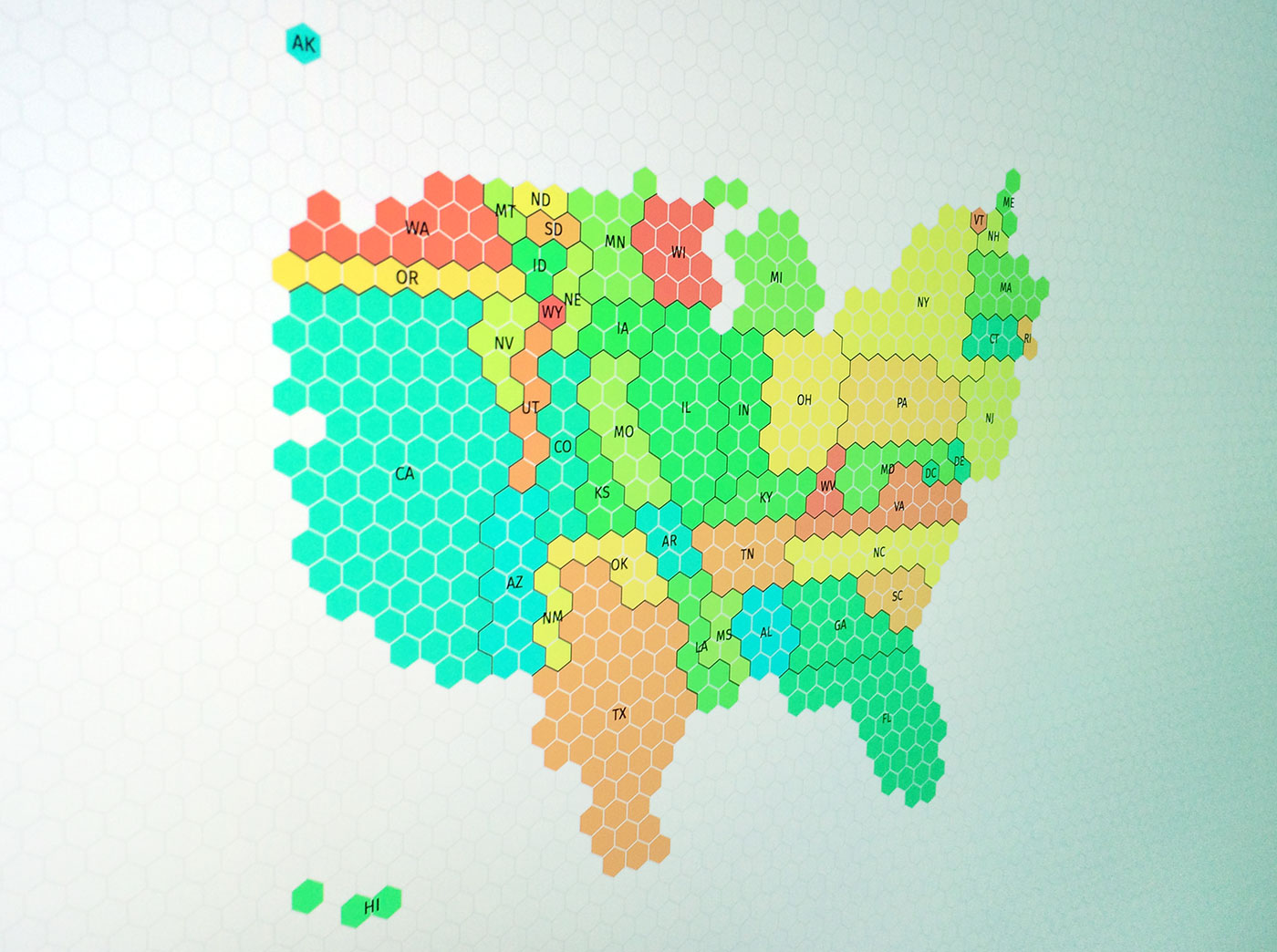
We began to hunt for a better fit—and one type of map quickly stood out. In the UK, cartograms recently underwent a resurgence (as documented by Kenneth Field and Andy Kirk), but these cartograms had an interesting visual twist. Rather than showing bulging, stretching boundary lines, they used hexagon tiles to show constituencies in the 2015 UK General Election. The uniformity of the grid made the geographic distortions of the cartogram more palatable. We knew that if we had one for U.S. counties, then we could solve our demographic data mapping problem. We began asking around.
@kennethfield @visualisingdata @JoshData Do you know of tessellated hexagon cartograms for US counties? Haven’t found any yet…
— Pitch Interactive (@pitchinc) August 17, 2016
But the answer—about whether anyone had ever made a county-level U.S. hexagonally-tiled cartogram—was negatory. So, without thinking too much about it, we began attempting to produce our own with professional map-making software. On the advice of Mike Bostock, we ran our dataset through ScapeToad; then we loaded the resulting GeoJSON into QGIS, applied a grid with MMQGIS, and converted it into TopoJSON with ogr2ogr, and so on… The results were gratifying, yet time-consuming. We wanted to streamline the process—to democratize the means of production!
We Have the Technology
The result of our work is Tilegrams, an authoring tool to produce these sorts of maps. We decided to build it because however awesome the cartogram algorithm, these maps still demand the careful eye of the designer/statistician, to verify that the map still bears a resemblance to the geographic shape it started with—while maintaining statistical accuracy.
Starting with Shawn Allen’s cartogram.js, and plenty of our own interpretation of the TopoJSON specification, our tool began life by ingesting any US state-level dataset, generating a cartogram and then sampling the output to produce a tiled map. Because these maps require so much human validation, we then implemented a handful of classic drawing tools: drag to move, marquee selection, plus some more specialized ones. Most importantly, we added a sidebar, informing the user of the statistical accuracy of each region’s surface area. (These tools are covered in more detail in the manual.)
We call these maps “tilegrams”—from “tiled cartograms”. We made our own US state map based on 2015 population (which you can download from the tool) and incorporated others that we saw and appreciated in the media: FiveThirtyEight’s electoral vote tilegram from their 2016 Election Forecast and NPR’s one-tile-per-state tilegram.
This is just a first step. The county-level US tilegram we set out to produce is still a mammoth effort away. (Our 50-state tilegram took a day to produce; how long would a 3,000-county tilegram take?) Our great hope is that news designers will be able to produce new tilegrams for interactive and print pieces, or use the ones we are sharing. And that developers will make open-source contributions to this fledgling effort. We want to share our progress now at this historic political moment, while demographic studies rule the news.
We are also grateful to Google News Lab for joining us in this crucial effort. Simon Rogers provides an excellent introduction to the tool, too.
Please do let us know (@pitchinc) if you use these tilegrams, or make your own.
Happy (socially just) map-making!