
Freeing the Lizard: Generating Mozilla’s Living Logo
 This year, Mozilla approached Pitch to redesign the logo into a living, breathing identity driven by community data that has evolved in so many ways since Mozilla’s beginning. In 1998 Shepard Fairey created the “Dino” that later became Mozilla’s mascot and has remained so over the last six years. In 2010, Mozilla started working with SNO, the studio Fairey worked at, to create another identity for the Mozilla Developer Network.
So, we had big shoes to fill.
 First, we set out to see what kinds of data we could use that reflected Mozilla’s identity while being respectful of privacy and staying true to the open source community. To show just how open Mozilla is, the identity project required no NDA between Mozilla and Pitch. We both agreed early on to make our work and the progress on the project public.
Check out this video to hear some words from both our team and Mozilla on designing in the open.
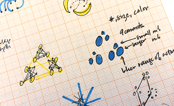
 Getting the right datasets took some time. Evaluating existing public data sources and then requesting custom APIs to be built to accommodate any modifications to the data required weeks of work. As we began to evaluate data, we got a sense of what we would have to work with: bug reports and usage stats that represented volume over time. We also had individual metrics such as the number of currently logged in users or days since the latest release of a product. Based on these datasets, we went to work hammering out ideas to help keep the creative juices flowing on the project.
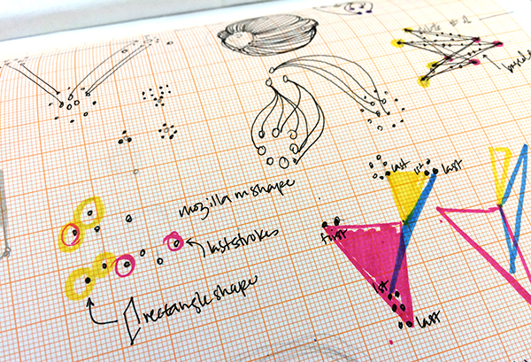
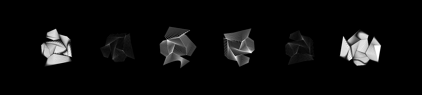
Our early concept designs served as an exploration for us on pushing the limits of how the visual could respond to the data. Since this is the largest identity project we’ve undertaken, we wanted to cover as many angles and options as possible. We ended up with dozens of different visual concepts:
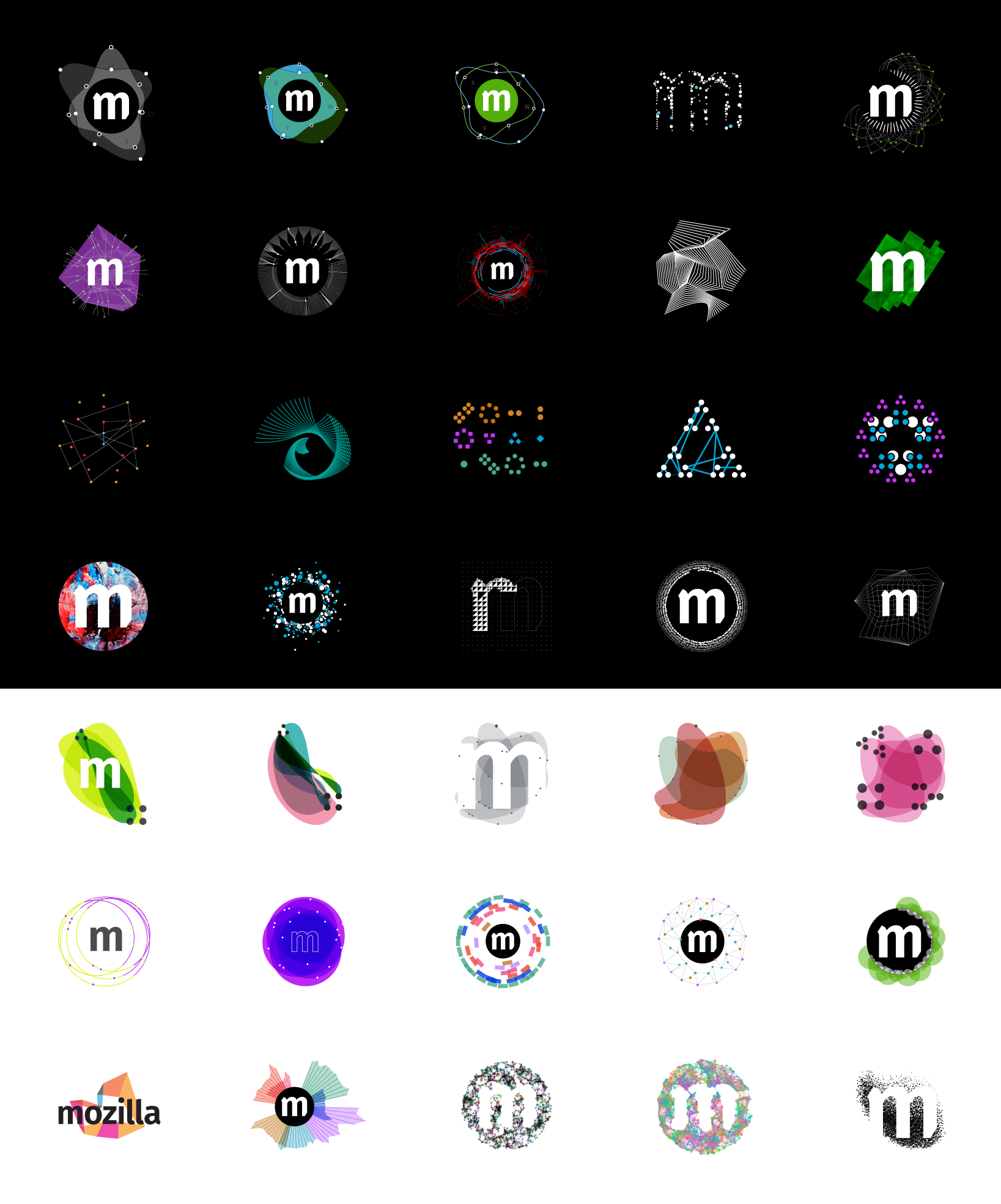
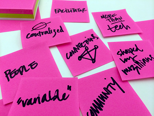
Swimming in endless options, we had to take a step back. This is Mozilla’s identity. It must represent what Mozilla stands for: bold, open, communal. Mozilla is a facilitator for connections to be made across the world. Their desire for a user-generated, ever-evolving logo needed to be met with a design that reflected the living, organic flow of Mozillians.
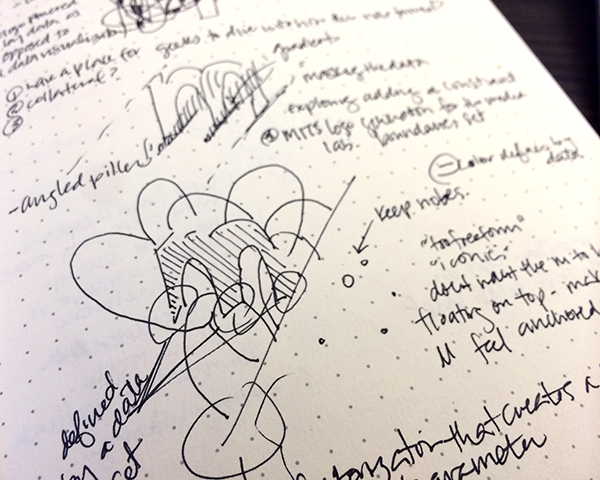
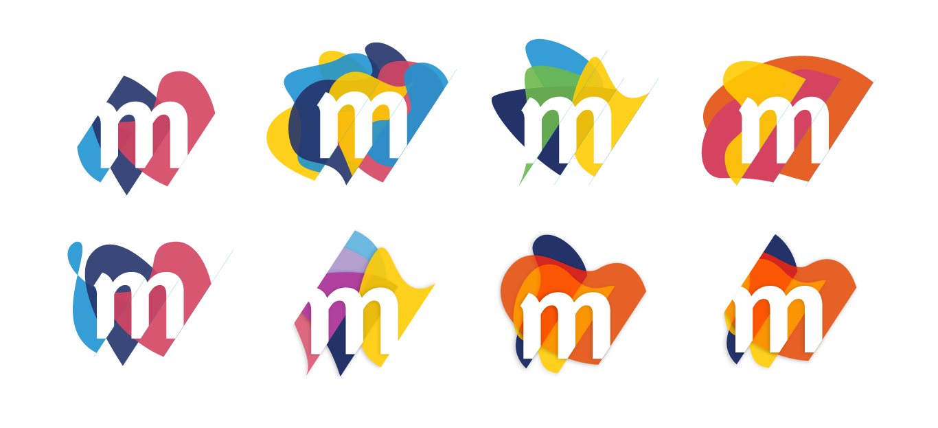
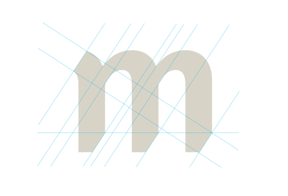
*For you type nerds: the original Mozilla type, Meta, was designed by Erik Spiekermann. Spiekermann is also responsible for the new font family Mozilla chose to use in the generative identity: Fira Sans. The final visual direction revolved around one very fine detail: the slice. When Mozilla’s new M mark stands alone, it’s ascenders and descenders are sliced. These created much opportunity to play with complementing organic shapes and create softness emerging from the harsh edges.

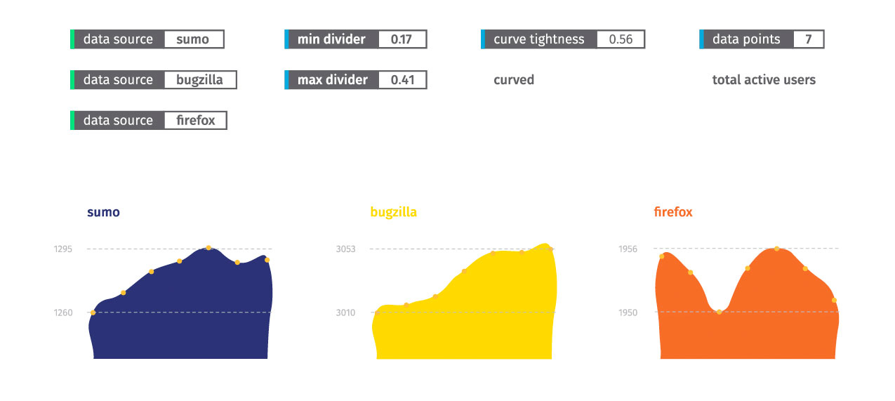
Currently, we’re implementing a web-based tool for generating the logo. The tool will give people the ability to control datasets, colors, and other key attributes before exporting the logo to an SVG. As we load in the data and play with the outputs, the shapes will inevitably change the look of the final design direction.
In the coming weeks, we’ll continue to share more on the evolution of the static logo and the logo generation tool as it goes through the prototyping and implementation process.